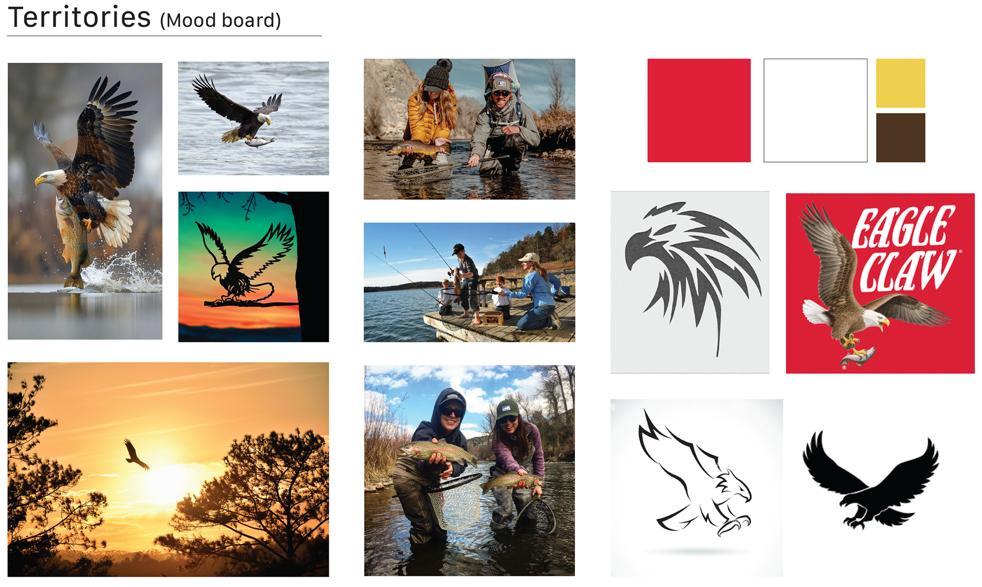
This logo redesign modernizes the Eagle Claw brand while preserving its legacy and appeal to its existing audience. The updated design simplifies the eagle icon, adjusting its angle for better recognition while maintaining its bold, powerful presence. A pop of color in the feet draws attention to the brand’s identity, reinforcing its connection to strength and precision. The refined typography enhances legibility while retaining the sharp edges that reflect the brand’s heritage and rugged appeal.
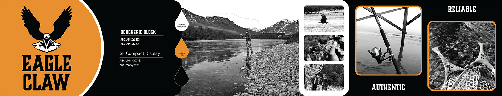


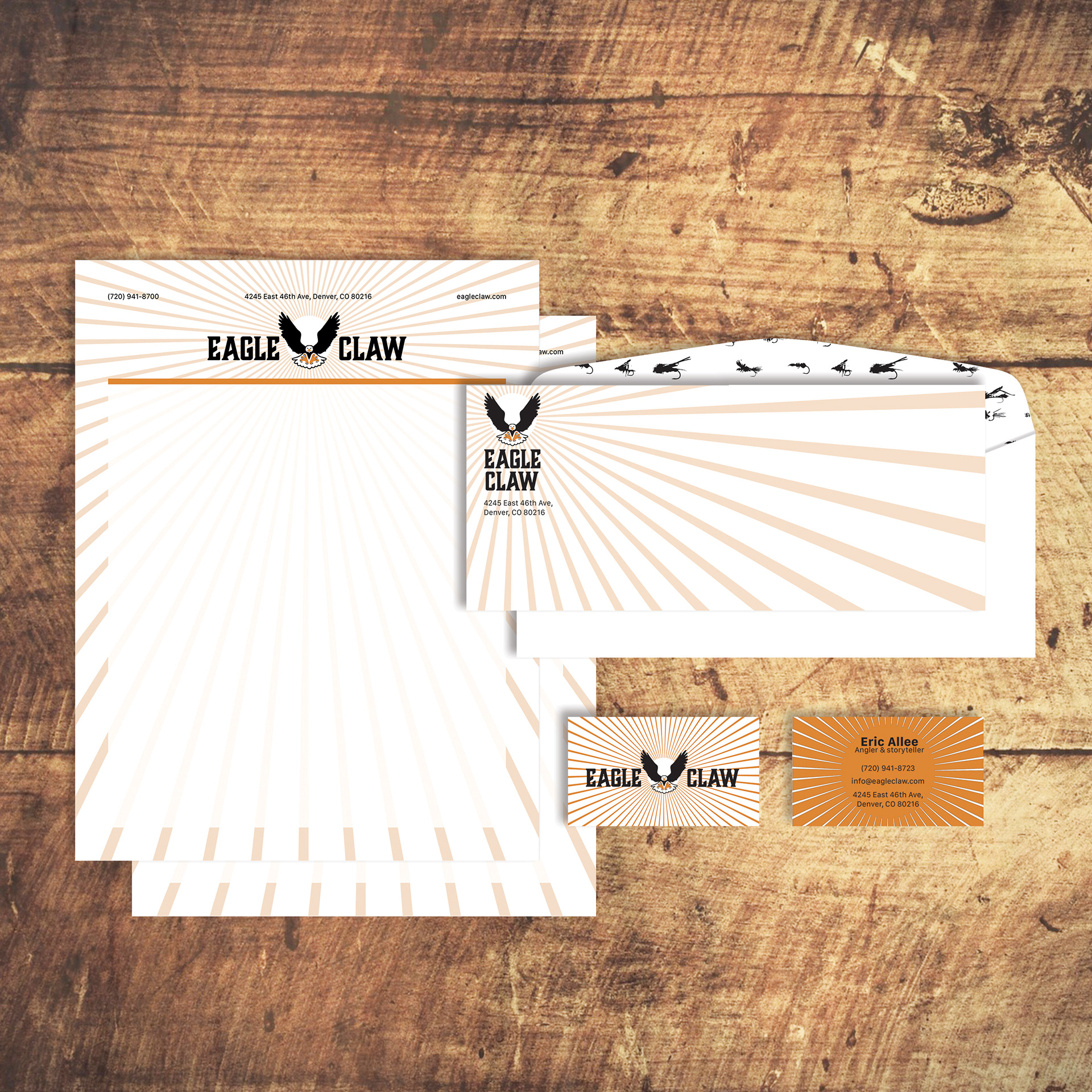
Completed for a branding class, this project challenged me to balance tradition and modernity, ensuring the logo remained recognizable yet fresh and impactful. By simplifying shapes and refining details, I aimed to create a mark that feels both timeless and adaptable across different applications. This process strengthened my ability to modernize brand identities while respecting their history and audience expectations.
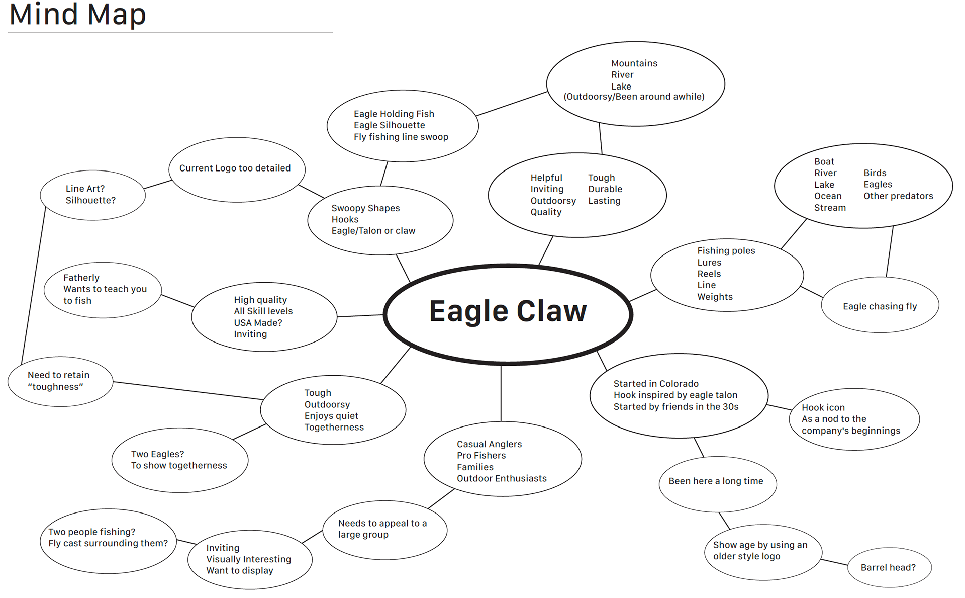
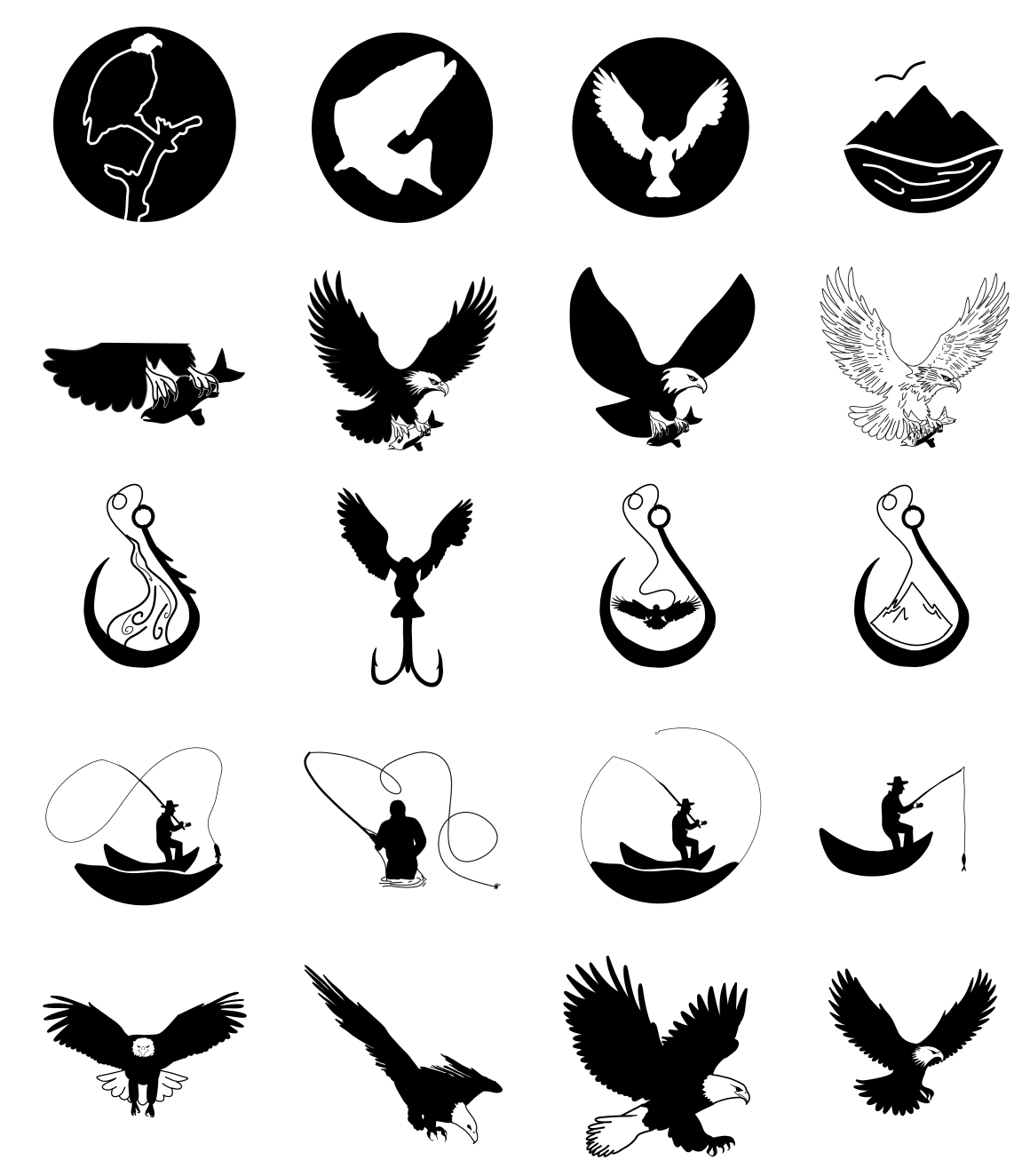
Process